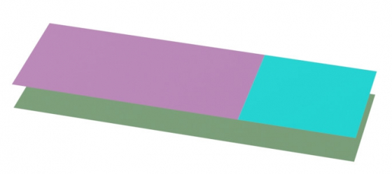
When designing an HTML page, sometimes it is necessary to make a fixed-width sidebar on the right side of the page with dynamically filling all the remaining space on the left.
It is easiest to make this using the markup with tables, but it is quite possible with common “<div>” elements as well.
First, let’s define two “<div>” elements for the left and right columns:
|
1 2 3 4 5 6 |
<div id="left_container"> left flexible colon </div> <div id="right_container"> right fixed width coloт </div> |
According to their id, we can assign CSS styles to them – set the right column to a fixed width and highlight both columns with different colors:
|
1 2 3 4 5 6 7 |
#left_container{ background-color:darkseagreen; } #right_container{ background-color:cyan; width: 300px; } |
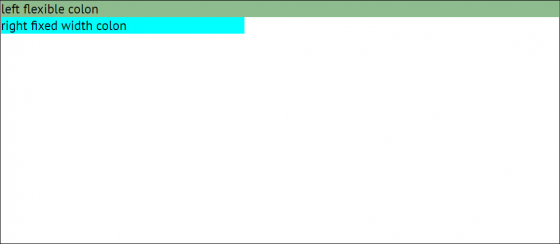
Now the elements are located one under the other.
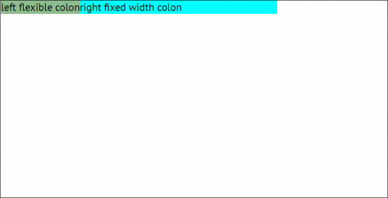
To position them side by side, we can set to both “div” elements the “float: left” property, specifying the element float to left.
|
1 2 3 4 5 6 7 8 9 |
#left_container{ background-color:darkseagreen; float: left; } #right_container{ background-color:cyan; width: 300px; float: left; } |
Now we need to push the right column to the right side of the page.
We can achieve the result by using the “margin” CSS property in a non-standard way.
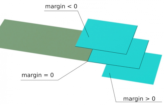
In the normal case of using the “margin” property, it adjusts the distance between elements. If the value of the property is null, the elements are located close to each other, and the larger the value, the greater the indent between the elements. If we set a negative “margin” value, the elements will overlap each other.
Let’s set the width of the left element equal to 100% – the entire width of the page, and set a negative “margin” value on the right so that the right element overlaps it to its full width. Since the fixed element’s width is set to 300 px, we need to set the “margin” value to -300 px.
|
1 2 3 4 5 6 |
#left_container{ background-color:darkseagreen; float: left; width: 100%; margin-right: -300px; } |
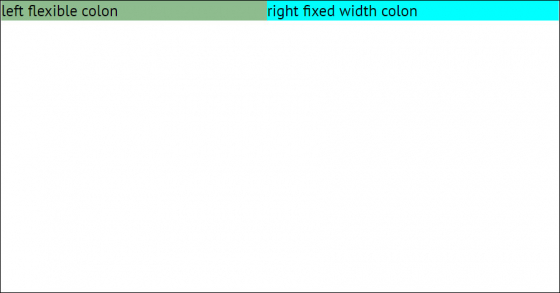
And we get just what we need:
Although the result we received looks like it should, it does not work correctly. When filling the left column with text, we can see that some of the text is hidden under the right column.
This is because, in fact, the left “<div>” element stretches to the width of the screen, and the right one covers it but does not resize it.
To fix this problem, let’s add another “<div>” element with id = “left_content_container” inside the left “<div>” element, into which we will actually enter the text.
The HTML markup will now look like this:
|
1 2 3 4 5 |
<div id="left_container"> <div id="left_content_container"> left flexible colon </div> </div> |
For the new “<div>” element, let’s assign a right margin equal to the width of the right column of 300 px:
|
1 2 3 4 |
#left_content_container{ background-color:plum; margin-right: 300px; } |
Now our markup looks like this:
And it works correctly – the right column has a fixed width of 30o px, the left column flexibly fills all the space left on the page. Now we can remove the color highlighting and use the layout for its intended purpose.
Full HTML and CSS code:
|
1 2 3 4 5 6 7 8 |
<div id="left_container"> <div id="left_content_container"> left flexible colon </div> </div> <div id="right_container"> right fixed width colon </div> |
|
1 2 3 4 5 6 7 8 9 10 11 12 13 14 15 |
#left_container{ background-color:darkseagreen; float: left; width: 100%; margin-right: -300px; } #right_container{ background-color:cyan; width: 300px; float: left; } #left_content_container{ background-color:plum; margin-right: 300px; } |

